
Blue Shield of California
Redesign of Enhanced Care Management referral form
Team size
Role
Product Designer
3-person design team
Project duration
Status
Shipped & launched as of January 2025
3 months
Overview
The ECM (Enhanced Care Management) Referral Form redesign was a compliance-driven update to align with new DHCS standards — scoped to support both adult and child/youth referral populations while preserving the workflows providers and internal teams already depended on.
Not every project starts with a blank canvas. This one started with a policy document and a deadline. The challenge was making compliance feel invisible to the people actually using the form.
The problem
The legacy form had quietly accumulated debt. Eligibility language was ambiguous — "child" alone carried three different definitions across systems (under 18, under 21, or under 26 for foster care). Backend business rules were being passed directly to users with no scaffolding to help them interpret them. Field labels were inconsistent, and UI patterns throughout felt disjointed.
The form was asking too much of its users and giving too little back.
my role
This was a cross-functional effort. On the design side, I was one of two product designers handling the UX and UI. Additionally, we had one content designer leading content strategy, and two product managers keeping us anchored to product and business requirements. Getting that mix right — especially on a compliance project where the source of truth is a government standards document — made a real difference.
Design & strategy
Making sense of the structure
Understanding the problem meant sitting with the original form flow long enough to feel where it broke down.
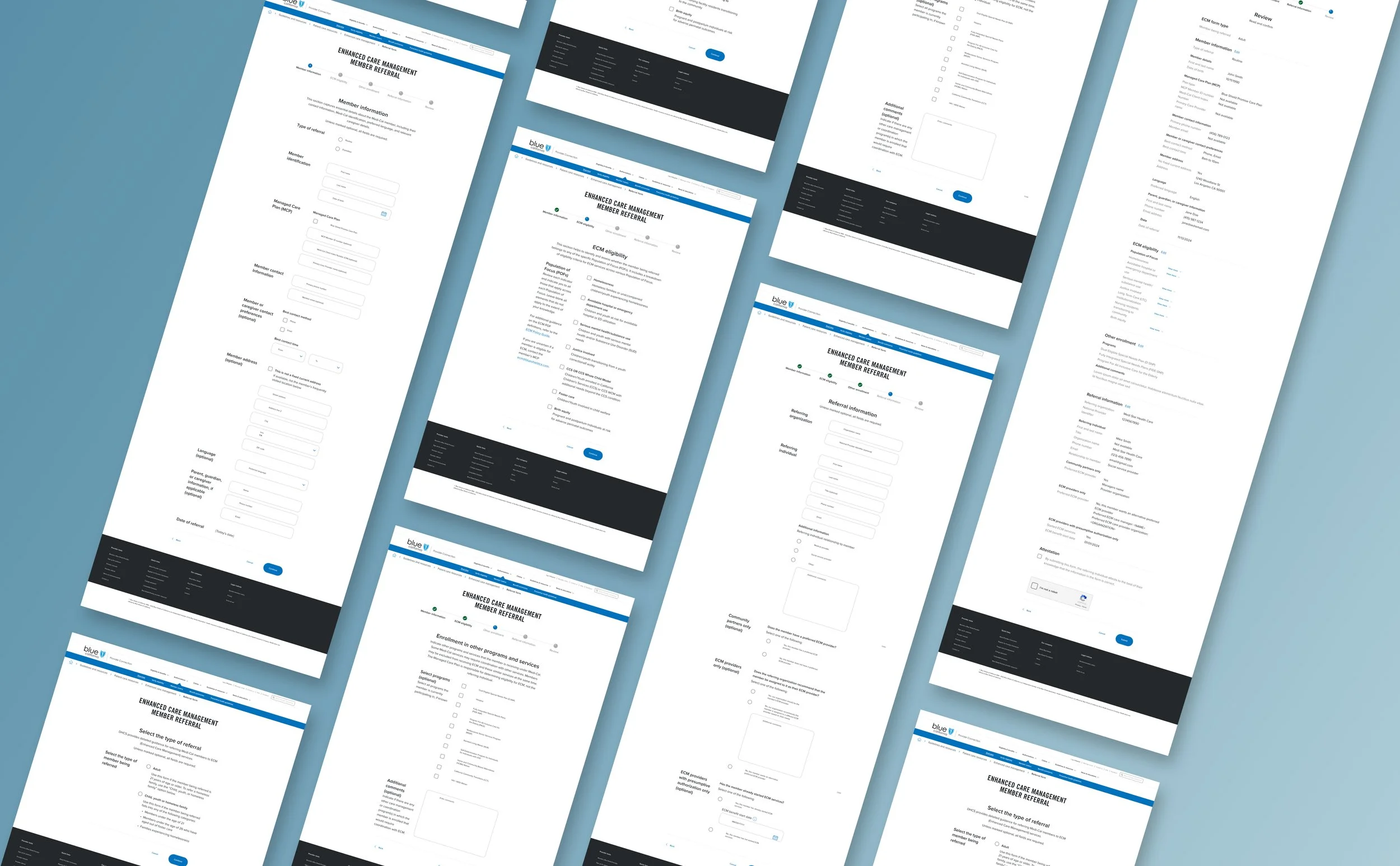
The legacy stepper moved users through five steps: Member Information → Medi-Cal Eligibility → ECM Eligibility → Referral Information → Review. On the surface, it looks reasonable. But in practice, the structure asked users to make eligibility judgments — including distinguishing between adult and child/youth populations — mid-flow, without any upfront context to orient them. The result was friction at exactly the moments the form needed to feel clear.
Two things needed to change: the logic of the steps themselves, and the point at which the form started asking hard questions.
The most meaningful structural addition was a prescreen step placed before the form begins. Rather than burying the adult/child distinction inside the flow, the prescreen surfaces it immediately — giving users a clear definition of each population type before they commit to a path. Homeless youth fall within the child path, so that distinction is handled there as well. From that single question, the experience splits into two focused paths, each surfacing only the fields and content relevant to that referral type.
The stepper logic was also reordered and renamed to better reflect what each step was actually asking:
Before
Member information
Medi-Cal eligibility
ECM eligibility
Referral information
Review
after
Prescreen — Type of referral
Member information
ECM eligibility by Population of Focus
Enrollment in other programs
Referral information
Review
Medi-Cal Eligibility as a standalone step was folded into Enrollment in Other Programs — a more accurate label for what that section was capturing. The reordering puts eligibility and enrollment ahead of referral details, which mirrors the logical sequence a provider follows when building out a case. And renaming the steps gave users a clearer signal of what each one was asking for, reducing the interpretive work the original labels left on the table.
Under construction 🚧