
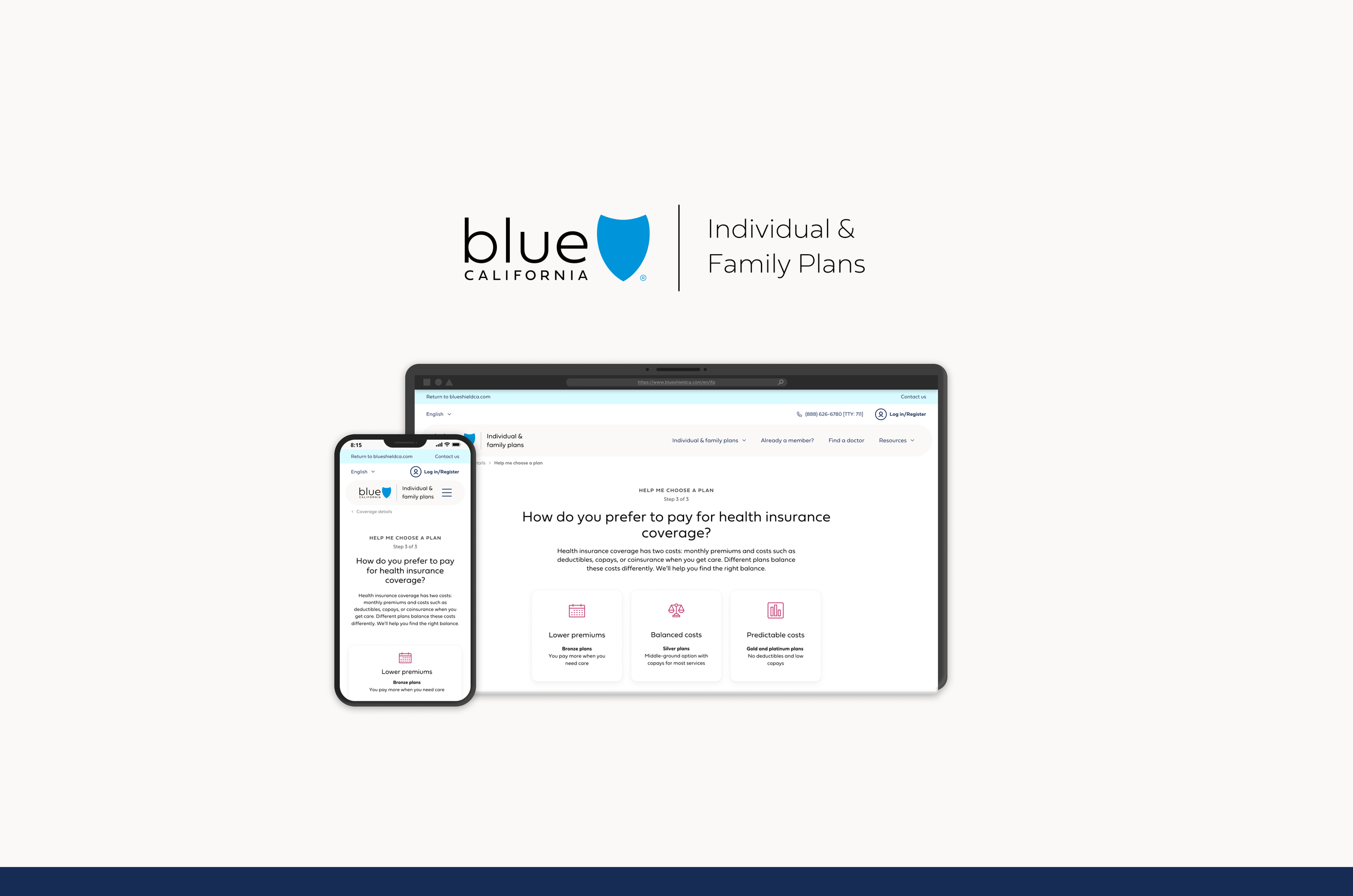
Blue Shield of California
Guided Shopping Experience
Team size
Role
Product Designer
5-person design team
Metrics
Project duration
9+ months
NPS Score: 51
Status
Shipped & launched as of October 14th, 2025
Overview
Health insurance shopping is intimidating. For many people, it's one of the most important financial decisions they'll make — and yet the experience of actually doing it is often overwhelming, confusing, and cold. The IFP (Individual and Family Plan) Guided Shopping initiative was Blue Shield of California's answer to that problem: a conversational, mobile-first experience that meets users where they are, walks them through the process with empathy, and helps them land on a plan they actually feel confident about

This was a total end-to-end and 0-to-1 build. Nothing like it existed in Blue Shield's ecosystem before. And over 9 months, our team got to dream big, test hard, and ship something genuinely new.
The problem
Shopping for health insurance isn't just complex — it's emotionally loaded. Users are making decisions that affect their health and their wallets, often without a strong foundation of healthcare literacy to lean on. The existing experience wasn't meeting them where they were. It was dense, clinical, and easy to abandon.
Our job was to simplify that journey: reduce friction, build confidence, and guide prospects toward a plan that actually fit their lives.
Users & Audience
We designed for two main groups: people who had health insurance before and were looking to switch, and first-timers — people we called prospects — shopping for coverage for the very first time. This audience ranged from ages 26 to 60, each coming in with vastly different comfort levels around healthcare terminology, digital fluency, and willingness to share personal information.
My Role
This was a true cross-functional effort. On the design side, I was one of two interaction designers on a five-person team that also included a content designer, a UI designer, and a user researcher. Beyond our team, we partnered closely with a product manager, a development team, and business stakeholders who helped us navigate what was feasible versus what was a pipe dream.
We worked entirely remotely — weekly check-ins, collaborative design sessions, and regular stakeholder debriefs kept us aligned and moving forward.
Scope & Constraints
The project ran from January 1st through a hard go-live date of October 14th, 2025 — 9 months of iterative design with a real deadline at the end.
What made this project special, though, was that we were given permission to shoot for the moon. Known colloquially as a "Blue Sky" initiative — we designed the most ambitious version of the experience we could imagine, then worked with stakeholders to figure out what was actually buildable. That process became one of the most valuable parts of the whole project. It gave us room to innovate and a clear framework for having honest conversations about scope.
The Process
Discovery & research
We started where all good design starts: listening. Our research phase was focused on understanding user needs, behaviors, and pain points — but also something more nuanced: how comfortable were people sharing personal information? What emotional triggers were driving (or derailing) their decision-making?
We ran stakeholder interviews, user surveys through UserZoom, and a competitor analysis through FigJam. In parallel, we began journey mapping to start connecting the dots between what users felt and where the experience was breaking down.
What we found shaped everything that came after:
Fewer, smarter questions — Users were getting lost in a long, undifferentiated questionnaire. The flow needed to be trimmed and restructured around what actually mattered.
Education baked in, not bolted on — Users needed context as they made decisions, not a glossary waiting for them at the end.
Recommendations that actually responded— The plans page needed to feel like it had listened. A static grid of options that ignored everything users had just shared wasn't going to cut it.

Our competitor analysis revealed that guided shopping experiences in the market typically asked between 2 and 5 questions before surfacing plan recommendations. That range became our testing ground. Users responded well to 2 questions — it felt fast and frictionless — but something nagged at them: was that really enough to give me the right plan? Confidence in the output suffered. We pushed to the other end, testing 4 and 5 questions on the assumption that more thoroughness would mean more trust. Five questions felt comprehensive to us, but users told a different story — drop-off increased, and on the backend, the added variables actually made it harder to return a clean, accurate recommendation. The answer, as legendary hip-hop artist De La Soul once put it, was that 3 is the magic number. Three questions hit the sweet spot: enough for users to feel like the experience knew something about them, not so many that they bailed before seeing a single plan.
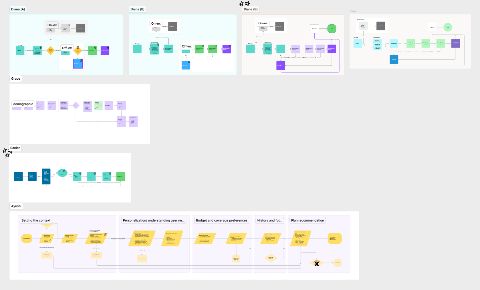
Lo-Fi & Early Testing
With a clearer picture of what we needed to build, we started putting rough ideas on screen. One of the first things we needed to figure out was how to handle the demographic section of the flow — specifically, did users prefer a linear experience or a progressive disclosure approach? It sounds like a small detail, but it had a big downstream impact on how the rest of the flow would feel.
This phase is also where one of my favorite moments of the project happened. Our stakeholders gave us the green light to truly explore our Blue Sky vision for the questionnaire. We started experimenting with using graphics and visuals throughout — illustrations for answer options, icons within demographic tiles, interactive visuals inside educational drawers we were starting to prototype.
Users loved it. The response was overwhelming. Visual cues made the experience feel less like filling out a form and more like having a conversation.
progressive

linear

Questionnaire & Content
The questionnaire wasn't just an interaction design challenge — it was a content challenge. We collaborated heavily with our content designer during this stretch because the way we asked questions mattered just as much as which questions we asked. Tone, clarity, empathy — all of it had to work together to keep users engaged and moving forward without feeling interrogated.
Testing, Insights, & Health Literacy
Our next round of testing cracked something open that we hadn't fully anticipated: healthcare literacy gaps were significant. Half of our test participants couldn't confidently distinguish between an HMO and a PPO. That's not a user failure — that's a design opportunity.
This finding recalibrated how we approached the entire educational layer of the experience. Every piece of copy, every tooltip, every educational drawer needed to meet users where they actually were — not where we assumed they'd be. Clarity, empathy, and relevance became our north stars for the rest of the project.

UI Polish & Plan Comparison
With our interaction logic and content strategy locked in, we shifted into high gear on UI. This meant tight, ongoing collaboration with our UI designer to take our scrappy lo-fi explorations and turn them into a polished, production-ready experience.
During this stretch, I took ownership of a piece I'd been especially invested in: the plan comparison page. The existing pattern was a lot — too much content, displayed side-by-side, with no breath in between.
Previously, there was no mobile version created during this phase of the shopping flow. This new revamp of the shopping experience allowed us to champion the “mobile-first” ideology into the plan comparison.
Going forward, the big tasks here would focus on:
A mobile-first approach to allow the full experience to prospects shopping on their mobile devices
Introducing a "Highlight Differences" toggle to cut through the noise and surface what actually mattered between plans
Making the plan header row sticky so users always knew which plan they were looking at while scrolling through the details
Taking ownership of the plan comparison page meant wrestling with a core tension: how do you present dense, side-by-side information on a small screen without losing the user entirely? Every decision had to earn its place. We stripped the header down to only the actions that mattered on mobile — cart and print — removing the CTA clutter that worked fine on desktop but felt overwhelming at smaller sizes. (And on mobile, print isn't really print — it's share, which actually made it more valuable to keep.) We shortened "Add to Cart" to "Select" after catching that the original label would wrap when users were comparing three plans side-by-side, breaking the visual rhythm at exactly the moment users needed clarity most. And we introduced alternating row shading throughout the comparison table — a small detail, but one that meaningfully reduced cognitive load by giving users a visual anchor as they scanned across multiple plans. None of these were glamorous decisions. But they're the kind of decisions that quietly make an experience feel considered
lofi concept

hifi prototype

Outcomes & Lessons Learned
We launched on October 14th, 2025. Nine-plus months of research, iteration, testing, and refinement — and it shipped.
Before launch, our research returned an NPS score of 51, outperforming competitors and earning the initiative recognition as "Best in Class" across multiple UX dimensions. That validation meant a lot, especially for a product that had never existed before.
As for what we took away from the process, three things stood out:
The "coming full circle" trap is real (and worth it) — Our team occasionally iterated so hard that we lost the thread, only to land back near where we started. In the moment, it can feel like wasted time. But those discarded ideas become your paper trail. They're how you show stakeholders — and yourself — why you landed where you did.
You can't design for a space you don't understand — Before we could simplify health insurance for our users, we had to genuinely learn it ourselves. That investment made every design decision sharper.
The NPS score validated something deeper than metrics — A score of 51 tells you people liked it. But what it really reflected was months of listening carefully, testing honestly, and never settling for "good enough."
Looking Onward & Next Steps
In the near term, the design team are continuing to work alongside the dev team in periodic QA cycles — catching any subtle shifts or gaps that surface post-launch and making sure the experience holds up the way we intended it to.
But the more exciting work on the horizon is something we had to reluctantly leave on the cutting room floor during this project: doctor and prescription selection. The idea is to give prospects the ability to input their existing doctors and medications during the questionnaire, allowing the recommendations engine to factor in network coverage and drug formularies when surfacing plans.
It was deemed out of scope for this launch — a practical call given our timeline and resources. But during our Blue Sky initiative, we tested the concept early, and the signal was hard to ignore. Users responded with noticeably higher confidence and satisfaction when their recommendations felt tailored to their actual healthcare needs, not just their demographics. It's one thing to recommend a plan. It's another to recommend a plan that covers their doctor.
That feature feels like the natural next evolution of everything we built. The foundation is there. And when the time comes, I think it has the potential to push this experience from "best in class" to genuinely indispensable.